At the start of my digital artefact, I wanted to establish a strong support system. By utlising my UNI friends and family it provided me with the motivation I needed to complete my DA. I was fortunate to have a solid idea from the beginning of my ideating phase. My first idea was to create both a digital portfolio and a series of small YouTube clips that will allow me to share both my progress and tips for other students that are also interested in the graphic design field. However through applying the #FIST method, in the first couple of week I found that I was not completing all of these tasks as I had started my project to big. due to this result I had made the decision to down scale my project as it would be more time efficient, which it has now become. By researching and viewing other graphic designers through their websites, for example Aaron Draplin I was able to learn and integrate their techniques by utilising similar design methods and colours.
As obtaining a portfolio through this DA, which was my main objective, I now have some successful logo designs that I can share with future employers to obtain a presence as a graphic designer. However during this process I did run into some problems that challenged my project, which can be seen below. however through these challenges it allowed me to create changes within my project to further develop and improve the DA for a better outcome.
Challenges faced:
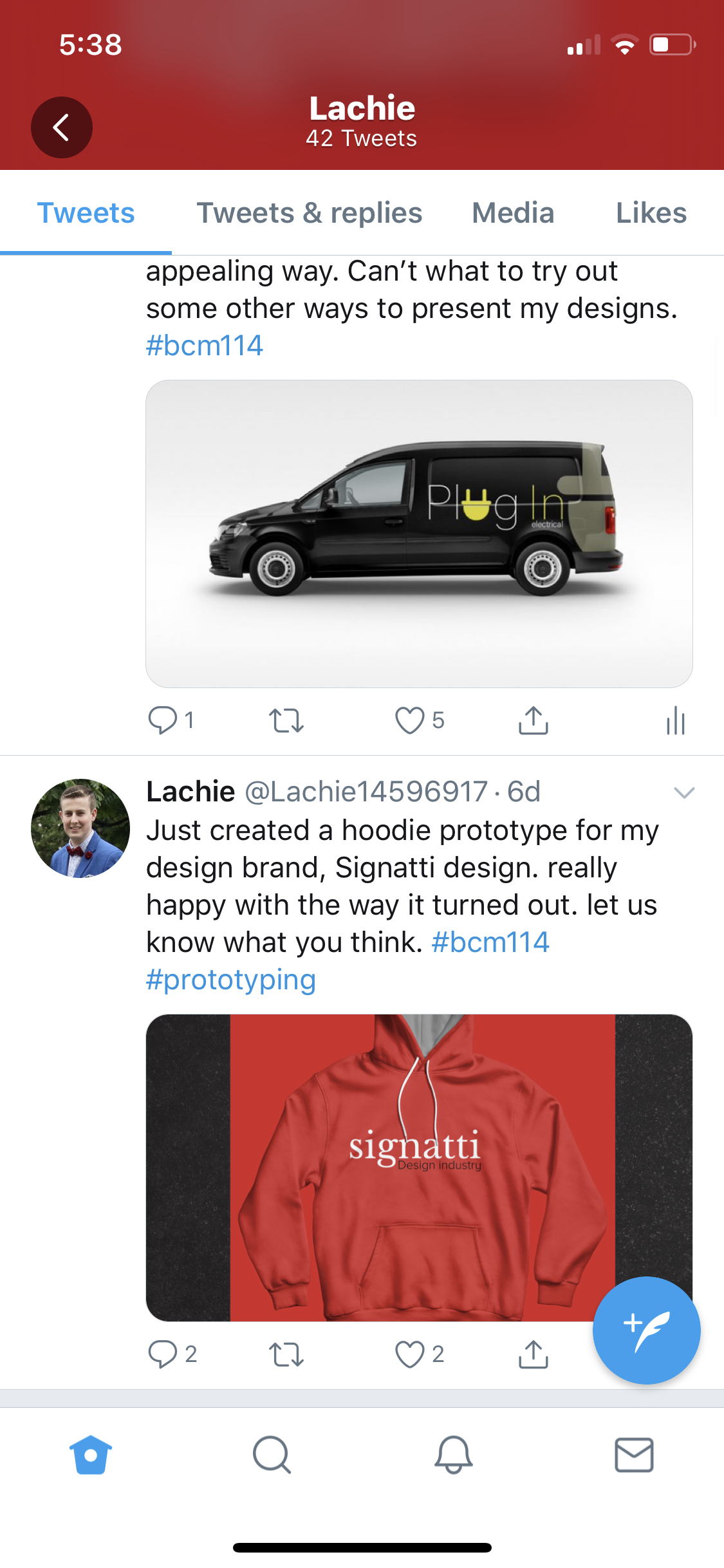
The way in which i present my work. At the start of my DA i had begun with just saving my logo designs as a jpeg and posting them on different platforms, including, Twitter and Instagram. After researching and asking other design students on ways on how to present logo designs to clients I have found a great app called ‘ Graphic burger’, through this app it allows me to put my designs in templates that can consist of objects like billboards, business cards and cars etc. Through presenting my designs in a more professional and visual way it would further allow me to build a more comprehensive portfolio and make the designs more interesting for my audience.

I applied the #FEFO method, As when I was publishing my logo designs I was not obtaining much audience reaction/ feedback. However through this method I decided to use the graphic burger app, which is seen above, this allowed me to further improve and experiment to see if it would allow for a more interactive audience engagement, which it now has.
Feedback:
The problem of not getting much feedback from my audience was not allowing me to develop on my logo designs, however, through researching and asking how other graphic designers how they develop and present their work I was inspired to create more logo designs, but this time present my work in a more visually appealing way which would make the viewers further engaged allowing for feedback. Since using the Graphic Burger app to make my designs more interesting I have gained positive feedback from my audience including;


Platforms:
Another idea i have been wondering about and have now changed is, expanding the amount of platforms that my designs are visible. However when expanding the amount of platforms my works are shared on I found that I was obtaining the most amount of feedback through my instagram page. Through this I decided to get rid of the other pages which would then allow me to further focus mainly on my instagram page.

The design process:

- Doing research on other successful graphic designers and what make their logos so unique are critical as it provides insight on what is trending and needed to create successful logo designs.
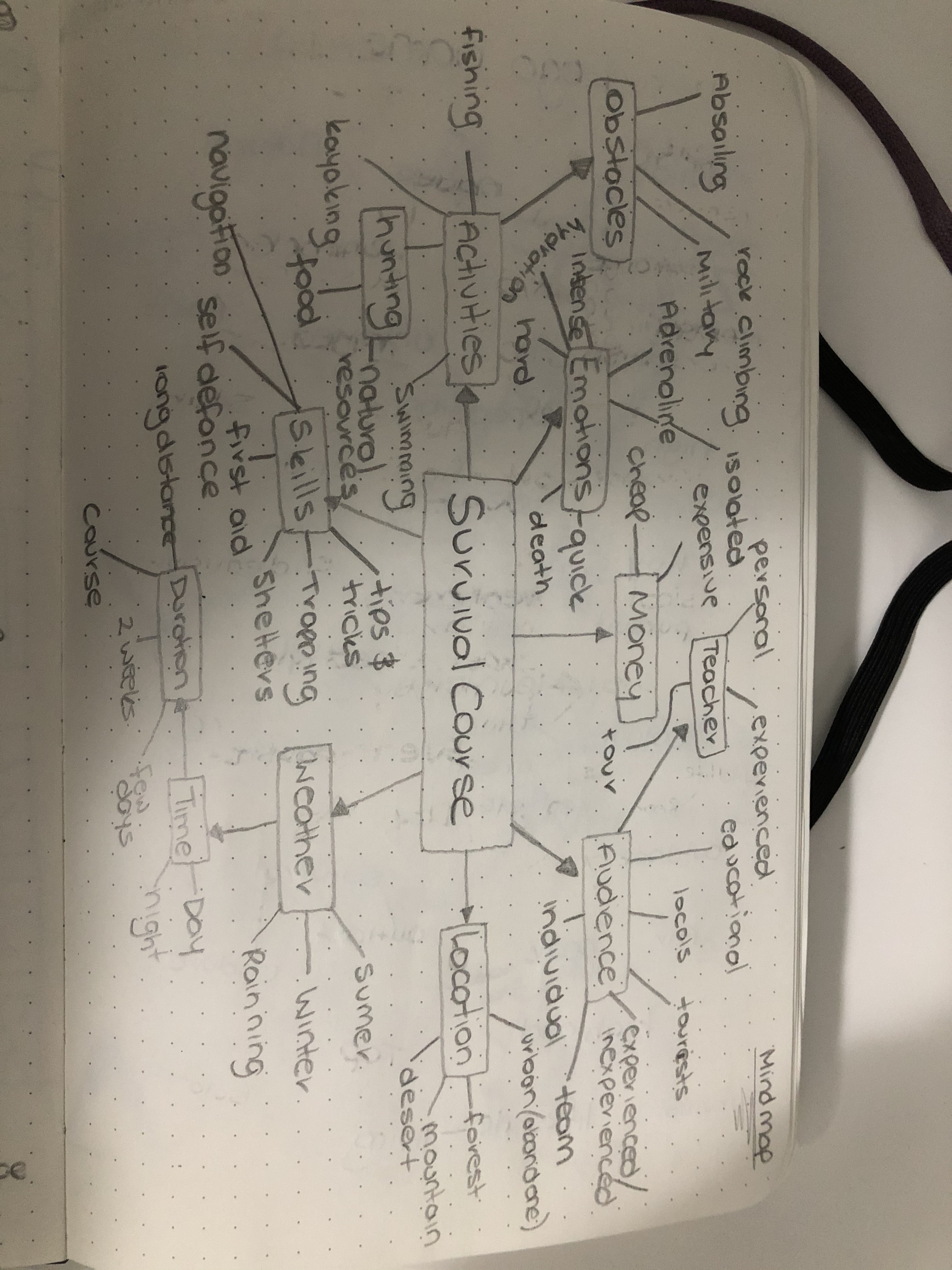
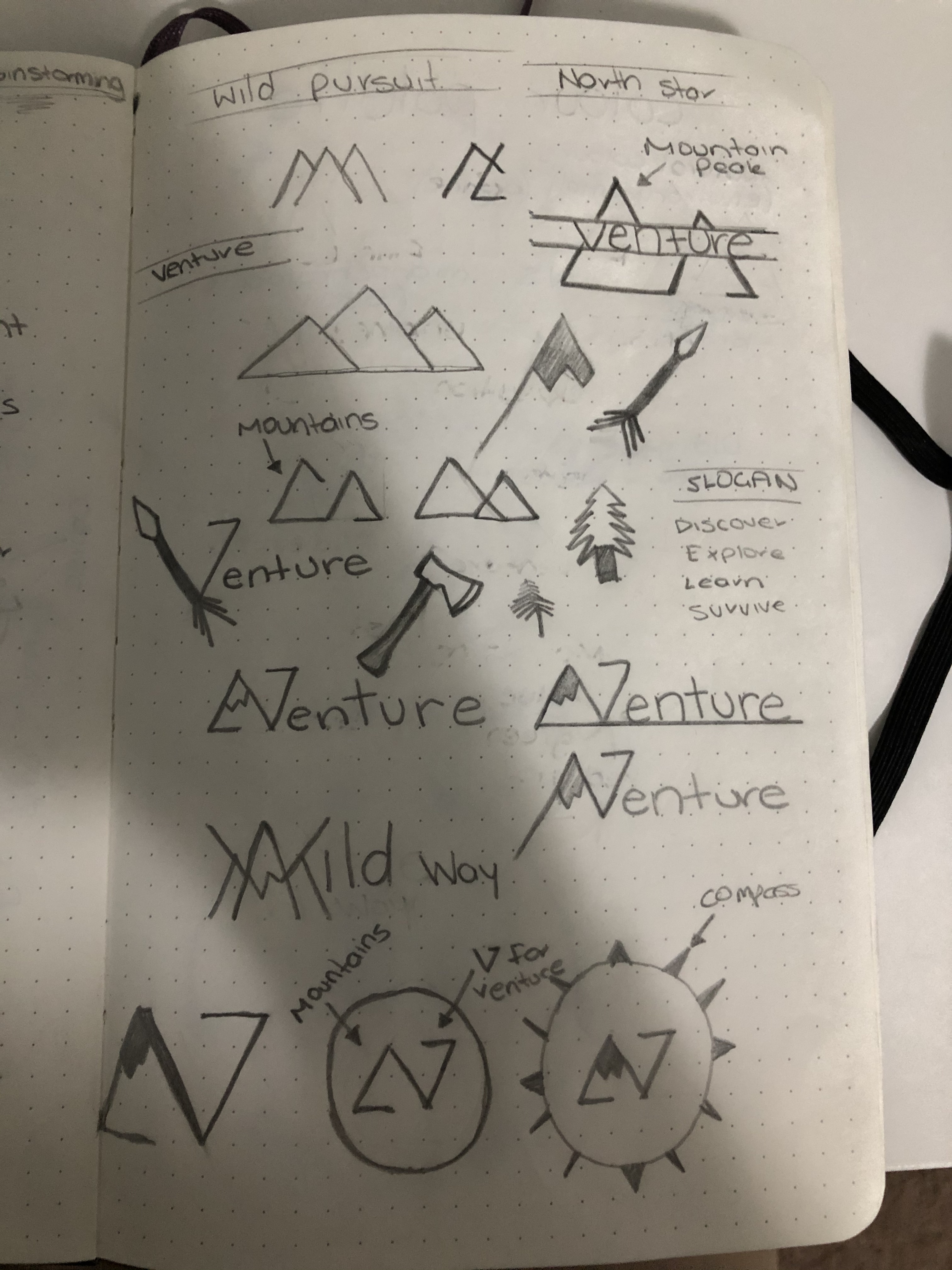
- By doing rough sketches in my sketch book not only does it highlight my process, but it allows me to create rough prototypes in a visual way allowing me to see what was successful and what was not, allowing me to make any changes that are needed in a more time efficient way.
- Afterwards I scan those rough prototypes into illustrator where i am able to improve upon them and chose a final colour palette. To choose my colour palette I always use pantone colours as they ensure your branding colour is consistent throughout when in comes to displaying your designs both on web and in print media.
- When creating an interaction between my audience i always post my designs on twitter and the Signatti design instagram page as it is crucial to gain feedback from other people in what they like and dislike allowing me to further change and develop upon both my skills and designs.
- After being provided with feedback from my audience I finalise the logo designs by making any final changes and refining them, leading to the publishing of them on my wordpress design page and instagram page where i can obtain a digital portfolio.
Drafts and sketches:
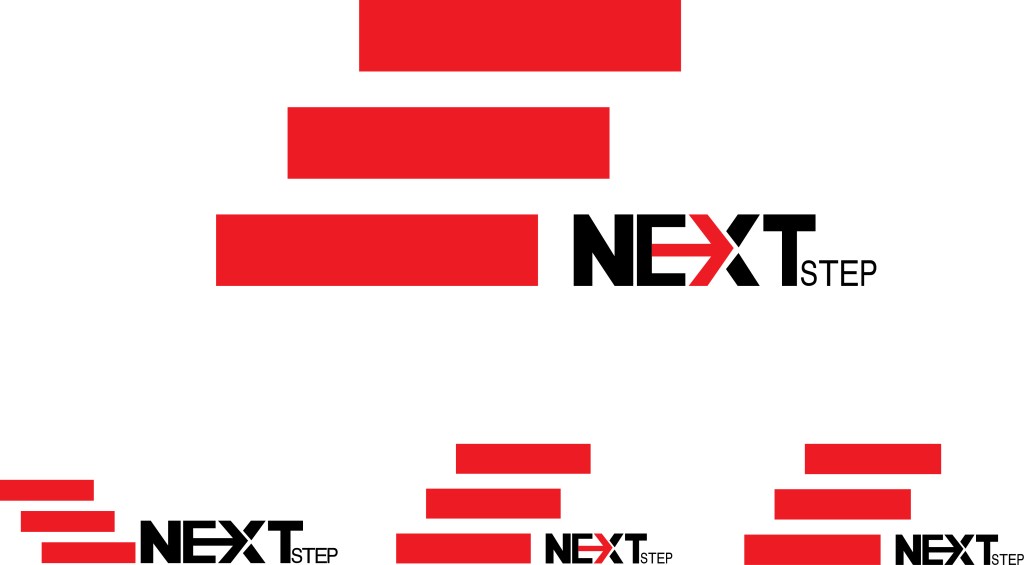
Through creating rough drafts in my sketchbook it allows me to experiment with different styles of typography and colour. Through creating these sketches it has allowed me to create prototypes of my designs in a quicker and more effective way that has allowed me to see what was successful and what was not. Afterwards, I would scan those drafts into illustrator where I would improve upon them and chose a final colour palette. When choosing my final colour palette I always use Pantone colours as they ensure your branding colours are consistent throughout. Through this process it has allowed me to create various logo designs which has further build upon my skills and technique, will obtaining a portfolio for future job prospects.


Artist inspiration: Aaron Draplin

Through researching other graphic designers I gained insight on the ways that they think when creating their logo designs and the way in which they use the tools such as the Adobe creative cloud and pen and paper to create their designs. When I came across designer Aaron Draplin i became instantly drawn to the way in which we designed his logos, they were clean and very vibrant allowing his targeted audience to see the fine details. After looking through some of his works i realised that most of the designs took a very minamalistic approach leaving me inspired to try to create some of my own following his methods. Attached below is a video that helped me to develop my design skills and understand what is needed to create a successful logo design.
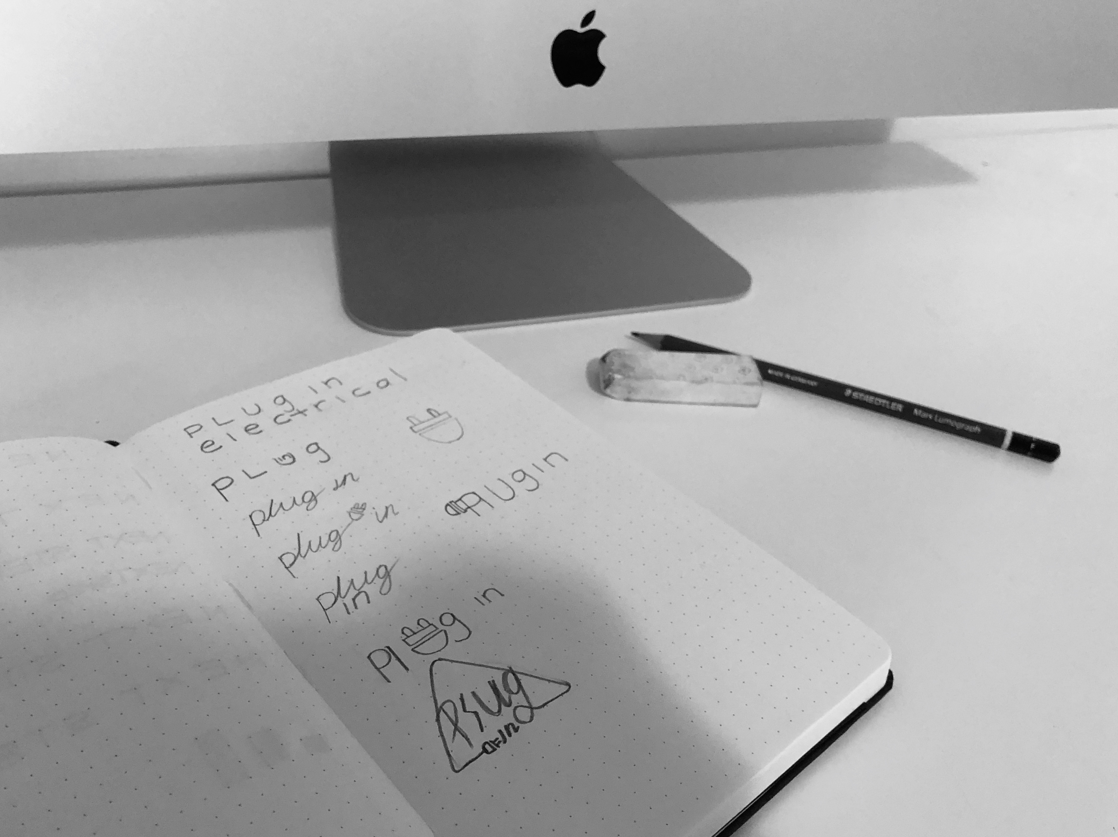
Signatti design logo: business name and instagram page


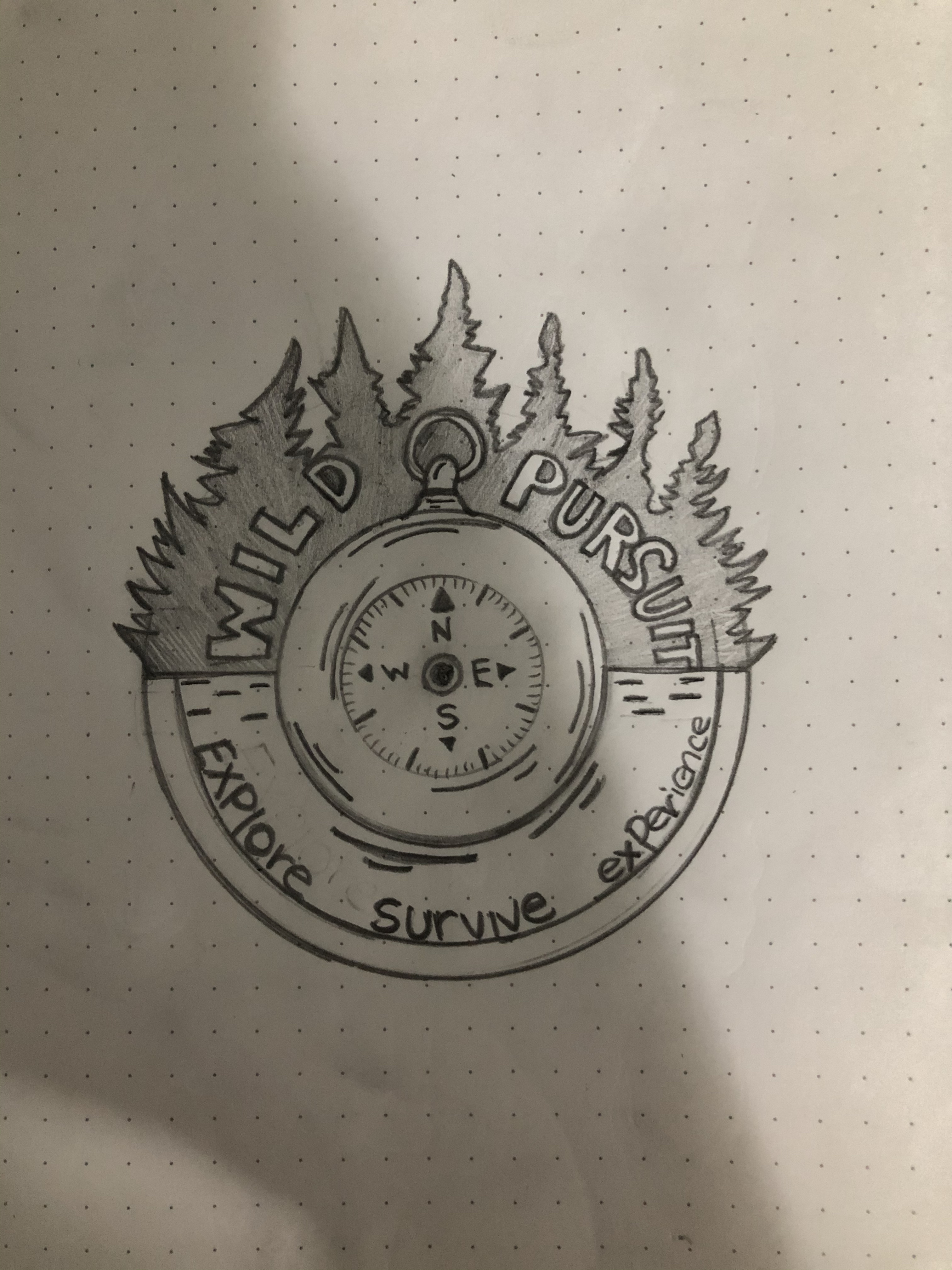
One logo design that i really enjoyed was the one I created for another student allowing me to experience and gain insight what it is like to work with clients especially as a graphic designer. Through the collaboration process of myself and the student i took inspiration for creating this logo from her personality, this would allow both the client to be proud of her brand and more appealing towards the audience allowing them to relate to the brand, as they have an understanding of the identity of the brand. Furthermore I have created other logo designs which have allowed me to further build upon my skills and technique, providing me a more extensive portfolio to provide for future jobs.
Digital portfolio:


Some Pages from digital portfolio:


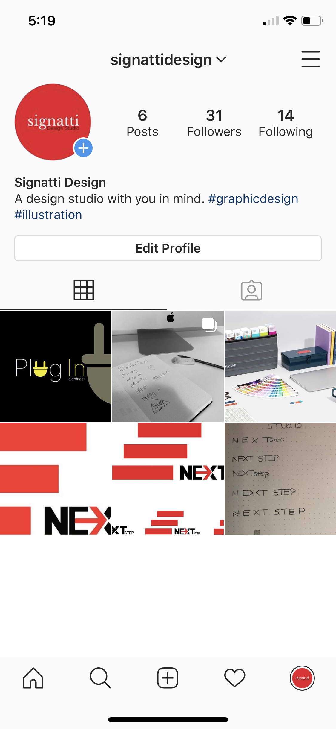
Instagram and WordPress page:
Instagram page- http://instagram.com/signattidesign/
WordPress page- https://lachlanmilne.design.blog/signatti-design/
Outcome and future changes:
Through the stage of developing my DA and doing various logo designs to build my portfolio, i have found the best designs are those ones that were created when i had collaborated with another students to build their brand identity. Through this process it gave me insight on the work and communication needed to create a logo design. Further through the comments i received on my instagram page has changed the way I will integrate any constructive feedback in my future BCM projects. Overall, this experience of creating various designs has influenced the way I approach anything I consider too difficult. I plan to continue this project over the rest of my degree to further develop my portfolio as a graphic designer as I plan to move into that field of work .
